Personal Site Redesign
Background
My first personal website was created a few years back. This was before I knew much programming at all, so it was all done in Wordpress using a fancy portfolio theme I found off Google.
Lately, though, I've felt that it was time to start over with a new site. The old site's design was a bit lacking for me, and I wanted something different. Luckily, I've recently been learning React. This was a good opportunity to practice building a website from scratch, using some very popular software tools.
Lately, though, I've felt that it was time to start over with a new site. The old site's design was a bit lacking for me, and I wanted something different. Luckily, I've recently been learning React. This was a good opportunity to practice building a website from scratch, using some very popular software tools.
Design
Before creating my site, I first took a look at my old website and tried to glean which features and design characteristics I liked and disliked. As it turns out, there wasn't a lot I liked about my old site.
The thing about Wordpress templates is that there's usually a lot of eye-candy. Wordpress sites tend to be full of bright colors and fancy transitions/animations. Here's an example of what I'm talking about: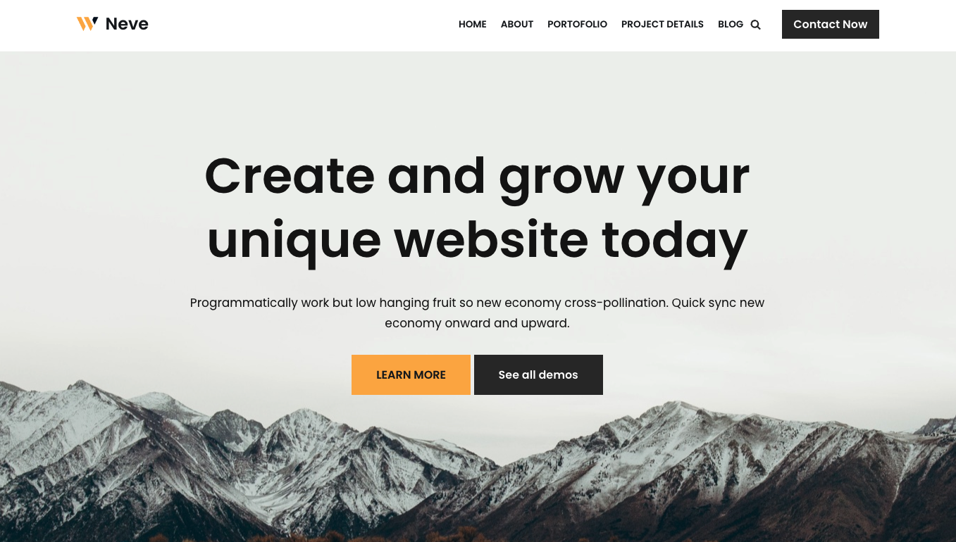 The younger me would have loved these sorts of flashy design traits, but nowadays I prefer a simple, clean layout to websites. In part, I think I am influenced by the design of my peers' websites, which are often very straightforward. Take a look at the personal websites of some graduate students at my school, for example: 1, 2, 3.
As you can see, these sites tend to just list out the important details without need for visual flair. I rather like the simplicity of these designs, since they allow you to quickly find any relevant information about the person in question. They are also not overwhelming to look at.
For my particular website, I decided to just stick with the basic elements, including the most rudimentary font (Arial), and a wide-margin rectangular space to put content on. The actual content would be generated with text sections placed one after the other. Since my layout was so simple, I also only needed two pages for my website: a “About” section with an introduction and a “Studio” section with essentially everything else.
All in all, my site turned out to look like this (but of course you've already seen it):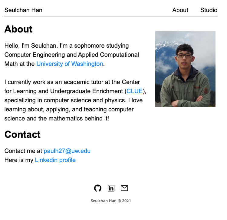
The thing about Wordpress templates is that there's usually a lot of eye-candy. Wordpress sites tend to be full of bright colors and fancy transitions/animations. Here's an example of what I'm talking about:
The younger me would have loved these sorts of flashy design traits, but nowadays I prefer a simple, clean layout to websites. In part, I think I am influenced by the design of my peers' websites, which are often very straightforward. Take a look at the personal websites of some graduate students at my school, for example: 1, 2, 3.As you can see, these sites tend to just list out the important details without need for visual flair. I rather like the simplicity of these designs, since they allow you to quickly find any relevant information about the person in question. They are also not overwhelming to look at.
For my particular website, I decided to just stick with the basic elements, including the most rudimentary font (Arial), and a wide-margin rectangular space to put content on. The actual content would be generated with text sections placed one after the other. Since my layout was so simple, I also only needed two pages for my website: a “About” section with an introduction and a “Studio” section with essentially everything else.
All in all, my site turned out to look like this (but of course you've already seen it):
Coding
The actual coding of my website was, like the design, fairly straightforward. I used React for the frontend, since I was already sort of used to using it. Looking back, though, my website was so simple that I mostly didn't even use the full power of the React library. I probably could have just created static html files for my website and served them instead. It would have worked just as fine.
Next, I used Express.js to create my web server. Again, there's nothing too complex here. The Express server simply serves a Javascript file bundled together from all of the React components. It also serves all of the static files such as images and downloads.
The full code for my website can be found here:
github.com/shan2024/Portfolio